

Through personalization, digital marketers can tailor customer experiences and journeys based on the needs and preferences of individuals. In a sense, you can show them only the content they want to see.
For example, let’s say you run a restaurant that accepts orders online and over the phone. You might want to only display your phone number when a visitor accesses your website through a desktop machine and a click-to-call button if they access it via smartphone.
What you’re doing is showing customers content (in this case, either your phone number or a click-to-call button) based on the user’s screen size. And, as a result, you’re able to deliver a personalized experience.
This tutorial will show you step-by-step how to show or hide Gutenberg blocks based on screen size.
Let’s put everything into context before we begin.
Displaying content based on screen size
You can set up pages and posts on your website to show or hide content based on screen size. This means that visitors will see content based on the screen size of the device they’re using to access your website.
For example, you might want to make certain content available on desktop or tablet only and hide it for mobile users.
Now, you might be wondering why you’d want to show or hide Gutenberg blocks based on screen size. Here are a few reasons:
- Deliver a better user experience. By displaying content based on screen size, you can deliver a better, more personalized user experience. You can set up your website to show only relevant content to visitors.
- Show what looks the best. You can show blocks that would look the best based on the screen size of the user’s device. For example, if you run an online store that sells clothes, you could set up your main shop page to show a grid of products for desktop users and a scroll-friendly interface for tablet or mobile users.
- Improve user flows. One of the main benefits of displaying content based on screen size is that you can create different user flows based on the screen size of the user’s device. For example, you can prompt mobile users to place a call, whereas desktop users get the option to fill out a contact form.
Showing or hiding Gutenberg blocks based on screen size is also a great way to deliver a personalized customer experience.
When you might want to show/hide Gutenberg blocks based on screen size
Let’s step through some use case scenarios for when you might want to show/hide Gutenberg blocks based on screen size:
Contact information
Most business websites display some sort of contact information – whether it’s a phone number, contact form, or email address.
For example, if you run a spa and wellness center, you might want to give customers the option to book an appointment by filling out a form on your website or calling in.
You can set up your contact page to display a phone number and an appointment form for desktop and tablet users. And, for mobile users, you can add a click-to-call feature that lets users place a call by clicking on the phone icon or the phone number.
Photo gallery and video content
If you publish lots of photos, photo galleries, or video content on your website, you might want to show or hide blocks based on the user’s screen size.
You might want to show the photos and videos to visitors using a desktop device and hide them on mobile. This way, you can show specific content to mobile users only and instead focus on the call to action button instead.
Landing pages
If you sell products or services, you can design lengthy landing pages with lots of images and animations for desktop visitors. The same page can be modified to show less content to mobile visitors. This way, mobile users get a simplified view of the landing page that shows them everything they need to know without compromising the user experience.
Page design
Web page designs that look good on larger screens won’t necessarily work for smaller screens. You can show or hide Gutenberg blocks to create a design for smaller screens (e.g. mobile screens and tablets) without worrying about focusing the desktop layout onto mobile.
Similarly, if you’re pro-mobile-first design, you might want to create experiences for users starting the design process from the smallest screen first. This is particularly useful for websites that know they get most of their traffic from mobile users.
How to show/hide Gutenberg blocks based on screen size
Here, we’ll show you how to show/hide Gutenberg blocks based on screen size. For this, you’ll need the Conditional Blocks plugin.
Step #1: Install the Conditional Blocks plugin
If you haven’t done so already, get the Conditional Blocks plugin. It’s the easiest way to show or hide Gutenberg blocks based on screen size in WordPress.
Install and activate the Conditional Blocks plugin on your WordPress website. Next, enter the license key you received at the time of purchase to start using the plugin.
Step #2: Add content to your page or post
The next step is to start adding content to your page or post. The Conditional Blocks plugin works with all default WordPress blocks as well as most third-party blocks.
Give your page a title and add blocks to set up your page. It’s important to have an idea of the page you’re building beforehand. This makes it easier to create the page for different screen sizes.
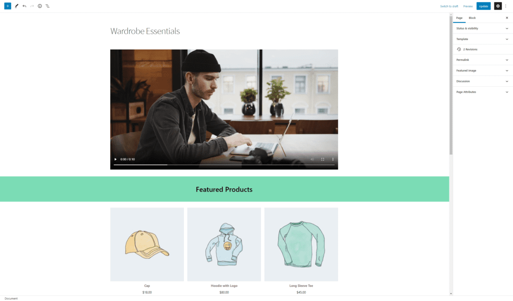
For example, let’s say you want to create a Wardrobe Essentials page to draw attention to specific products. You want visitors using a desktop machine or tablet to be able to see the campaign video you produced for the products. On the flip side, mobile visitors should only be able to view the collection of products.
Once you’re done designing your page, click the Save draft button.
Step #3: Configure conditions to show/hide content blocks based on screen size
Now that the page is set up, all that’s left to do is configure conditions to show/hide content blocks based on screen size. Here’s how you can do this using the Conditional Blocks plugin.
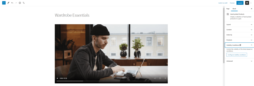
We want to hide the video block from visitors using a mobile device. Here’s what you need to do:
Click on the video block. From the Block settings on the right-hand side of the screen, click the Visibility Conditions tab and then the Configure visibility conditions button.
Next, you’ll see the Conditionals Blocks Pro popup window on the screen. From here, you can start adding conditions for the video block. Click the Add condition button to get started and set it up as follows:
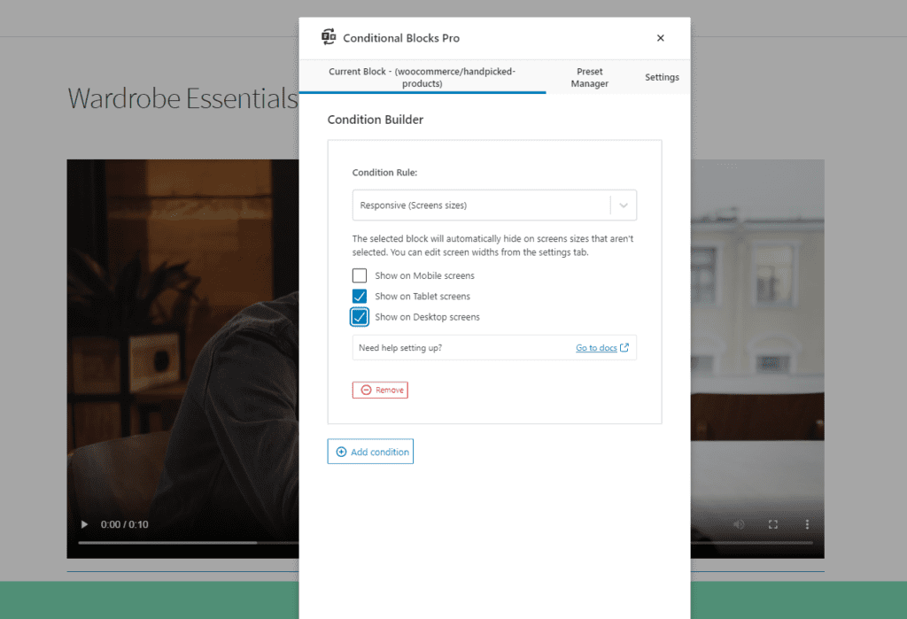
- Set a Condition Rule. Since we want to hide this block from mobile users, we’ll select the Responsive (Screens sizes) condition.
- Click the checkbox next to the screen sizes you want to show the block on. It will automatically be hidden from any screen sizes that aren’t selected.
This will hide the block from visitors using a mobile device. However, the video block will be visible to visitors using a desktop machine or tablet.
Here’s what the page will look like on different sized devices:
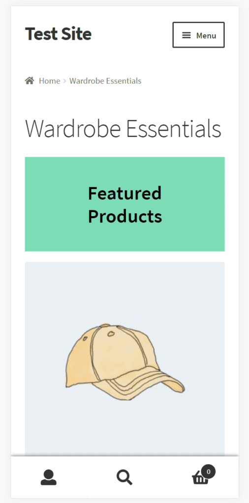
1 – Mobile preview 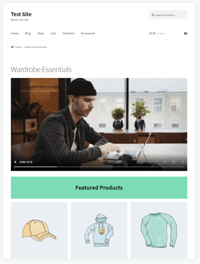
2 – Tablet preview 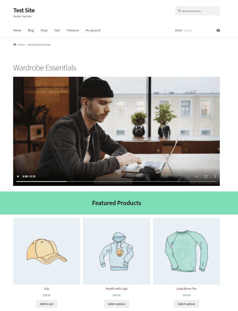
3 – Desktop preview
Bonus: show/hide Gutenberg blocks based on devices and browsers
In addition to this, the Conditional Blocks plugin also lets you conditionally display blocks based on the user’s web browser or device. This means that you can show or hide blocks for visitors using an iPhone, Android device, or the Google Chrome browser. This is possible with the User Agents (Devices & Browsers) condition.
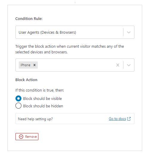
You should consider using the User Agents (Devices & Browsers) condition if you want to show or hide content that’s specific to the user’s device or browser.
For example, if you want to encourage users to download your app, you can show a link to your app on the App Store to visitors who are using an iPhone or macOS device and the Google Play Store link to Android users.
Conclusion
There are plenty of reasons why you might want to show or hide Gutenberg blocks based on screen size. It’s perfect for delivering a personalized user experience and making sure your pages look the best regardless of the end user’s screen size.
Using the Conditional Blocks plugin, you can easily show or hide content blocks based on the screen size of the user’s device. All you have to do is select which screen sizes the content block should be visible on.
Looking for an easy way to show or hide blocks based on screen size? Get Conditional Blocks today!