WordPress Blocks are all different sizes and may not always fit your design in different screen sizes.
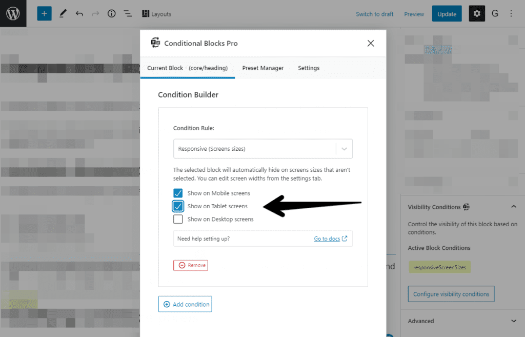
You may want to only show specific blocks on mobile devices and hide them on desktop screens. The Responsive (screen sizes) condition will give you the control to choose when your blocks should appear in the viewport.
Available Block Screen sizes
Conditional Blocks will give you the following options to choose from:
- Mobile Screen size
- Tablet Screen size
- Desktop Screen size
TIP: Want to display a WordPress block on Tablet & Desktop size screens only? No problem! You can mix and match the screen size options by clicking the toggle.
Modifying screen size pixels
Some WordPress themes have different “breakpoints” that are slightly different from the defaults in Conditional Blocks. A “breakpoint” is a screen size (in pixels) where your theme will automatically change the layout to fit a different size screen.
You can change the breakpoints that Conditional Blocks uses by going to the Settings tab inside the Conditional Block modal popup.
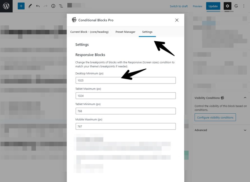
We recommend that you check your theme documentation or ask the developer to confirm the correct breakpoints.